Distinctive Gem
CASE STUDY
Distinctive Gem is a specialized online retailer focusing on colored gemstones and customized jewelry. To enhance user experience and address reported issues, we undertook a comprehensive research and design process.
Research:
We conducted usability testing with 5 participants and card sorting exercises to identify navigation difficulties, visual design shortcomings, and trust issues.
Design:
Based on research findings, we revamped the website’s structure for better navigation, updated the visual design for greater appeal, and added interactive features to improve user experience and build trust.
Table of content
Introduction
Executive Summary
Research
Overview
Heuristic Analysis
Feature inventory Chart
Usability Testing
System Usability Scale
Accessibility Audit
User Journey Map
Card Sorting
Problem Statement
Solution
Design
Site Map
Sketches
Wireframes
Mid-Fidelity Prototype
Conclusion
Introduction
Executive Summary
Distinctive Gem, is a premier destination specializing in colored gemstones and offers a diverse range of jewelry products. The company stands out by providing extensive customization options, allowing clients to create bespoke pieces tailored to their preferences. In addition to its product offerings, Distinctive Gem is committed to educating customers through a wealth of resources on gemstones and jewelry. The company also maintains a blog featuring insightful articles related to its field. Customer support is a priority, with multiple contact options available, including email and phone, ensuring accessible and responsive service.
Research
Overview
The research phase aimed to identify the shortcomings of the existing Distinctive Gem website and uncover opportunities for enhancement. I employed various methodologies, including a heuristic evaluation and competitive analysis. Heuristic evaluations revealed several issues such as inconsistent navigation, complex language, and an unclear layout. The competitive analysis of brands like Tiffany and James Allen highlighted best practices and features missing from the current website.
Key findings from the research included:
Inconsistent Navigation: The current site featured a confusing double menu and inconsistent navigation options.
Complexity in Customization: Users found the customization options for rings and diamonds unclear and difficult to navigate.
Visual and Structural Inconsistencies: Issues with color usage, font sizes, and the overall layout were observed.
Research Methodology:
Competitive Analysis, Heuristic Analysis, Usability Test (Quantitative Research), Post-Test Survey (Qualitative Research), Journey Map & Accessibility Research.
Our goal is to position Distinctive Gem as a compelling alternative to competitors by delivering a seamless and engaging user experience.
Heuristic Analysis The user research was conducted with a variety of methods including a deep understanding of the actual website applying the Heuristic Evaluation to solve Issues in the UI and apply them as opportunities.
Feature Inventory Chart as competitive Analysis
A Feature Inventory Chart is a useful tool for comparing the features of different competitors websites, allowing me to clearly see what can been improved or changed. For the Distinctive Gem website, I created a Feature Inventory Chart to compare the elements of the current website with the competitors elements.
Here’s a structured approach to a Feature Inventory Chart for Distinctive Gem:
By analyzing these elements, Distinctive Gem can identify key areas for improvement and opportunities for differentiation. Enhancing product variety, customization options, educational resources, and customer support can help the company better compete with established online jewelry stores and attract a wider customer base. Implementing these insights will position Distinctive Gem more favorably in the competitive landscape and drive growth and customer loyalty.
Usability Test(Quantitative Research)
Overview:
The usability test is a crucial component of our quantitative research aimed at evaluating how effectively users interact with the Distinctive Gem website. This test involved five participants and was conducted to gather actionable data on user experience and site functionality.
Testing Goals:
The primary goals of this usability test were to:
Understand User Interaction: Observe and analyze how users navigate and interact with the website.
Identify Usability Issues: Detect any pain points or challenges users encounter during their interactions.
Improve Website Structure and Layout: Gain insights into potential enhancements for the website’s structure and layout to improve overall user experience and functionality.
Purpose:
The purpose of this usability testing was to:
Observe User Behavior: Track how users complete specific tasks on the website to identify areas of friction or confusion.
Collect Feedback: Gather qualitative feedback from participants about their experiences, which will help in pinpointing areas for improvement.
Enhance User-Friendliness: Utilize the insights obtained to refine the website’s design, making it more intuitive and user-friendly.
Logistics:
The usability test was conducted remotely using the video conferencing platform Zoom. This setup facilitated real-time observation and communication, allowing for a flexible and efficient testing process. Participants were guided through tasks and interactions while their actions and feedback were recorded for analysis.
This approach ensures a comprehensive understanding of user experience, enabling us to make informed decisions to enhance the Distinctive Gem website’s usability and overall effectiveness.
System Usability Scale
To deepen our understanding of the user experience issues, we utilized the System Usability Scale (SUS) form, which was completed by each interviewee. Participants rated their level of agreement with each statement on a scale ranging from "Strongly Disagree" to "Strongly Agree."
Average time of the 5 usability tasks took 11:62 Min/Sec.
Average time of each (1) task took 2:32 Min/Sec
Quotes from participants
Findings: In general all users found that the page was confusing, specially the navigation menu with its dropdown menu information. They were not sure how to find some tasks, and some took them more time to figured out, and others use different paths like using the searching input data.
Insights:
Difficult to navigate the menu
Inconsistent use of color, font (capital letter), and space.
Some elements are not clickable and do not even present a dialog message of error.
Hidden Filter Options: the filtering for engagements rings are hidden behind an icon or a drop-down menu that isn’t immediately obvious according to the users.
Some users got lost completing task and when directly to homepage as undo or go back.
Recommendations:
Add Labels to Navigation Icons ("Home" label alongside the home icon. “Cart Icon” label as shopping cart-For the collections, use " Fine Collections" with a diamond icon..)
Color palette that is both aesthetically pleasing and easy to read. Modify colors/contrast to comply with ADA standards
Images should be clear and with same background.
Advanced Customization-Visible Filter Options: filtering criteria like "Type," "Price," and "Color" ,"Carat Weight," "Metal Type," and "Availability.")
Eliminate unnecessary purchases bottoms
Create exits, cancel button. (Undo and redo)
Accessibility Audit:
According to: Web Accessibility Evaluation Tool (WAVE), there were some issues found on the Distinctive Gem website.
Problem Statement
Users have reported that the Distinctive Gem website is challenging to navigate, lacks visual appeal, and undermines their trust in making a purchase.
Solution
Enhance the website’s structure and layout to make it more intuitive and user-friendly. This includes reorganizing content for easier navigation, updating the visual design for greater appeal, and adding interactive features to improve overall user experience and confidence in purchasing.
Design
Overview
Based on the research, a redesign was proposed to address the identified issues. The design focused on streamlining navigation and enhancing user-friendliness. Key elements of the redesign included:
Simplified Navigation: A clear, single navigation menu was introduced, making it easier for users to find and select products.
Improved Customization: Icons and labels were added to improve clarity and ease of use for customization options.
Enhanced Filtering Options: Advanced filtering options were streamlined to avoid overwhelming users, making it easier to select diamonds based on specific criteria like budget and shape.
The design process involved sketching ideas, mid-fidelity wireframes to refine the website’s layout and functionality. The prototype was then developed to test these design improvements.
Sketches
Wireframes
Homepage Product List Product Detail
Prototype:
The prototype featured a more intuitive user flow for creating custom rings. Key improvements included:
Streamlined Product Selection: Users can now easily navigate through diamond shapes and customization options.
Clearer Filtering Options: Filters are now more concise, allowing users to quickly narrow down their choices based on budget and preferences.
Enhanced User Interface: Improved visual elements and a more consistent design enhance the overall user experience.
In conclusion, the redesign of the Distinctive Gem website has successfully addressed several critical issues identified through research. By simplifying navigation, enhancing customization clarity, and refining the filtering options, the new design offers a significantly improved user experience. Future improvements will include developing a mobile version of the site to ensure accessibility across all devices.
Artifacts:
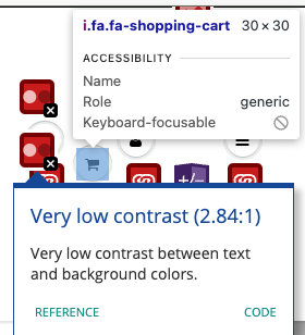
Shopping cart button have 2 violations
Violation 1 (Not distinguishable): The shopping cart button has poor contrast between text and background and does not pass to the minimum requirement AA.
Violation 2(not text alternatives: The shopping cart is an element that does not contain text and we have to attribute a label name into the design and coding, should have aria language. Roles indicate as generic and that don't explain that the element is a shopping cart button.
Violation of the color palette
The main colors of the website Do not pass the contrast color .
Need to be changed for another color palette of better contrast color.
Positive: The element search input includes Accessibility that means that the voice command reader can read and say (Search box) the green check mark means that the search button passes the Accessibility and is present.
Negative: However the search button does not have enough contrast.
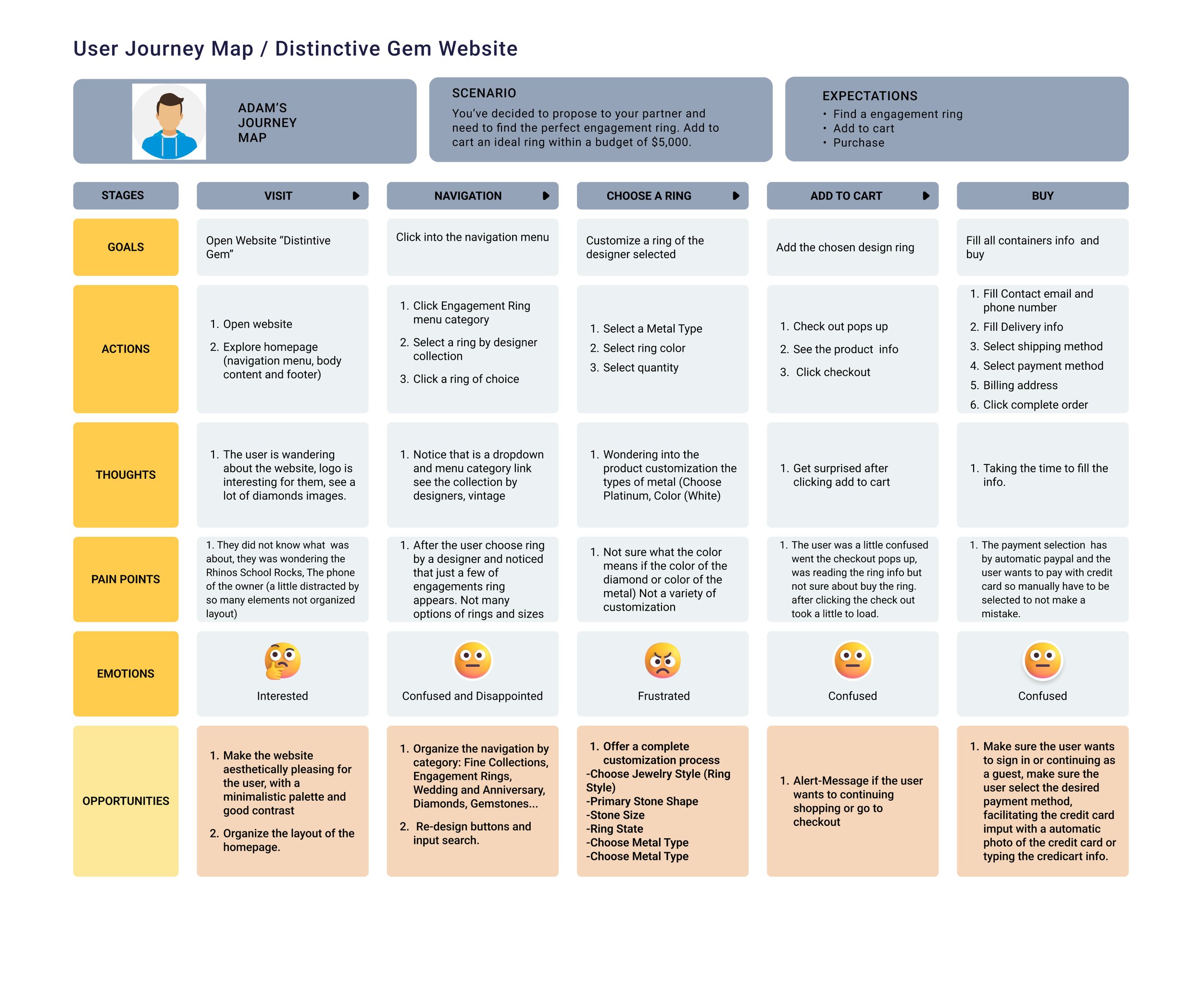
Journey Map
Provides a detailed visualization of the steps users take while interacting with the Distinctive Gem website. Following the usability test conducted with five participants, this map highlights the key stages, touchpoints, pain points, and opportunities for improvement in the user experience.
The user journey map highlights critical areas for improvement, including homepage clarity, filter functionality, customization tool usability, and the checkout process. By addressing these pain points and leveraging the identified opportunities, Distinctive Gem can enhance the overall user experience.
Card Sorting
For Distinctive Gem, I conducted a combination of open and closed card sorting exercises to gather insights into how users interact with and organize information related to gemstones and jewelry.
Open Card Sorting (3 Sessions):
Objective: To understand how users independently categorize and group information about gemstones and jewelry, and to identify patterns in how users perceive the structure of the site.
Process:
Participants: 3 users
Tool Used: Trello
Procedure: Participants were given a set of cards representing different categories, features, or pieces of content related to gemstones and jewelry. They were asked to organize these cards into groups that made sense to them and to label each group with a name they felt was appropriate.
Closed Card Sorting (1 Session):
Objective: To validate the categorization and labeling of information based on predefined categories, ensuring the final structure aligns with user expectations.
Process:
Participants: 1 user
Tool Used: Trello
Procedure: Participants were provided with a predefined set of categories and asked to sort a set of content cards into these categories. This helped in assessing whether the predefined categories were effective or needed adjustments.


